COORS LIGHT
CoorsLight.com Site Redesign
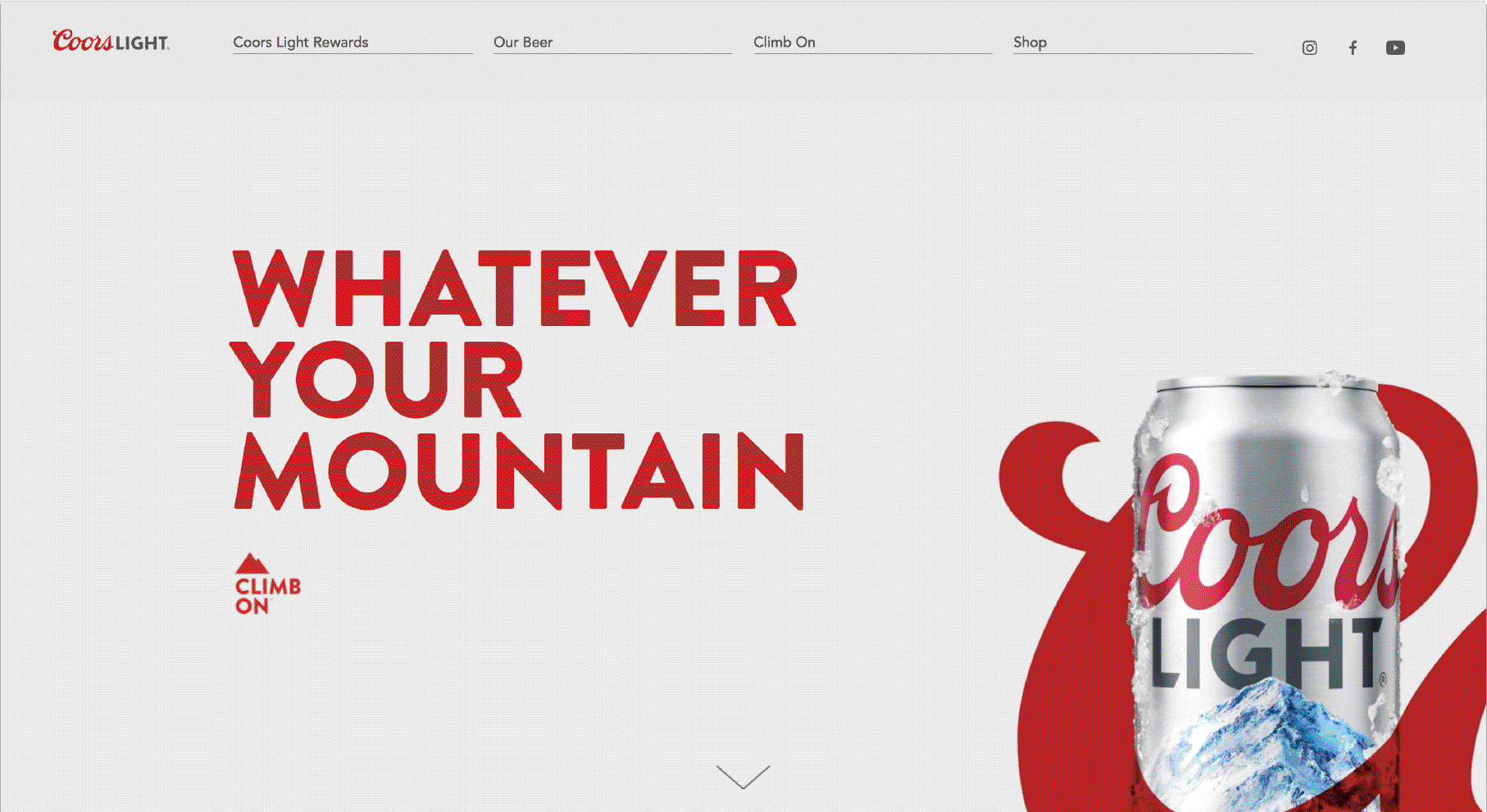
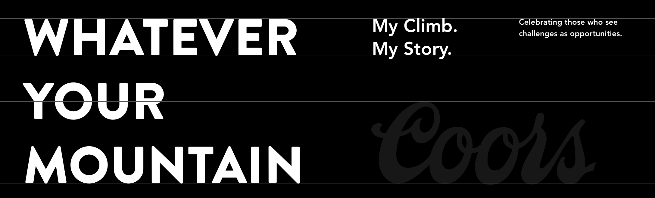
For years, Coors Light Brand’s Visual approach was
black and white with hits of red. The goal was to elevate
the exterior of their can by evoking what was inside–
not just beer, but the spirit of the Rockies.
The goal was to shift the sole focus away from the exterior (the packaging) and delve into the world of
the spirit–
the beverage and its origins.
Color photography was reintroduced in both lifestyle and product shots, combining the metallic silver bullet
look and feel with the blues and red from the on-can typography.
The Rocky Mountain’s signature blue skies and snow were emphasized to represent the awakening of the senses.
The blue and metallic hues on the Photography gave it that same touch of coolness on the lips, after that very
first sip, when a crisp, cold beverage is enjoyed and one is overcome with that fulfilling sensation when a beer hits the right spot.
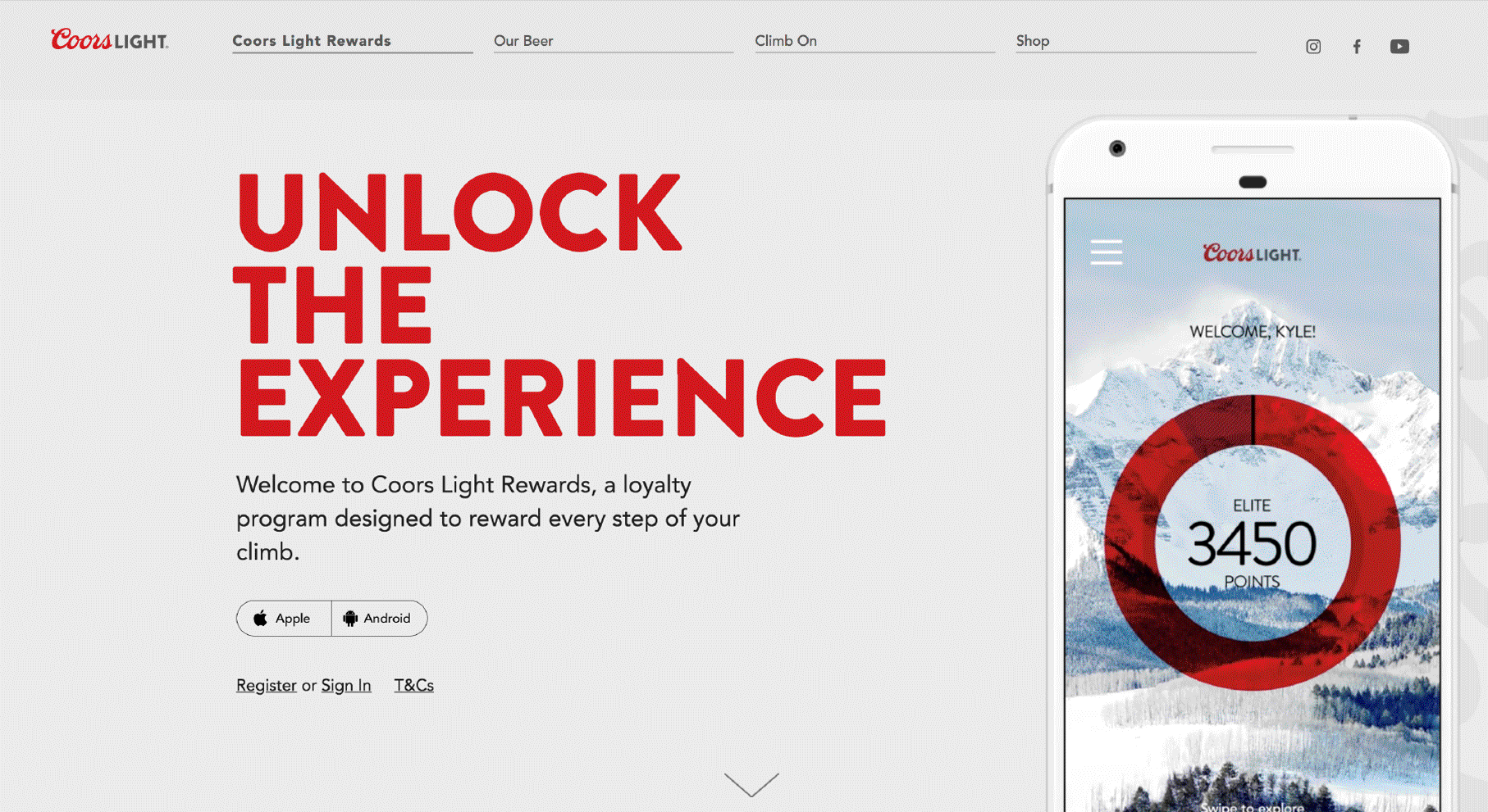
The web experience was worked on to clearly separate their storied history, product information, and retail locations.
Eventually, this work served as a catalyst, expanding
into the visual approach for coorslight.com and informing
the refreshed branding in their print and film campaigns, which further emphasized the use of color.
As a creative it feels great to be a part of pushing
a brand like Coors Light in a fresh direction.
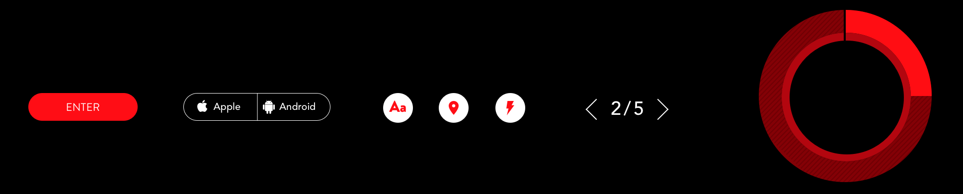
Visual Elements
CoorsLight.com Mobile Site
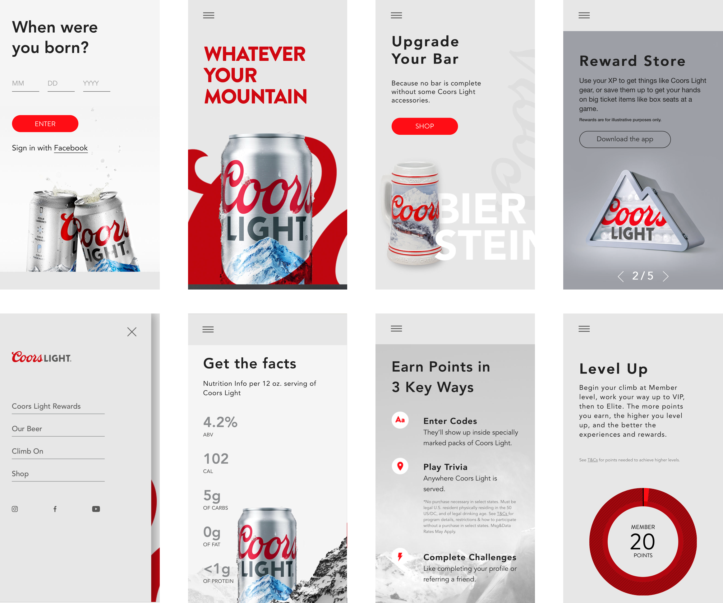
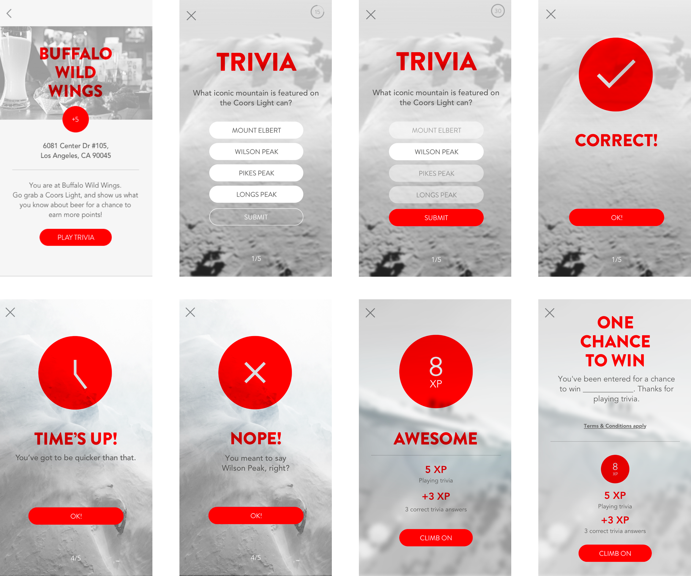
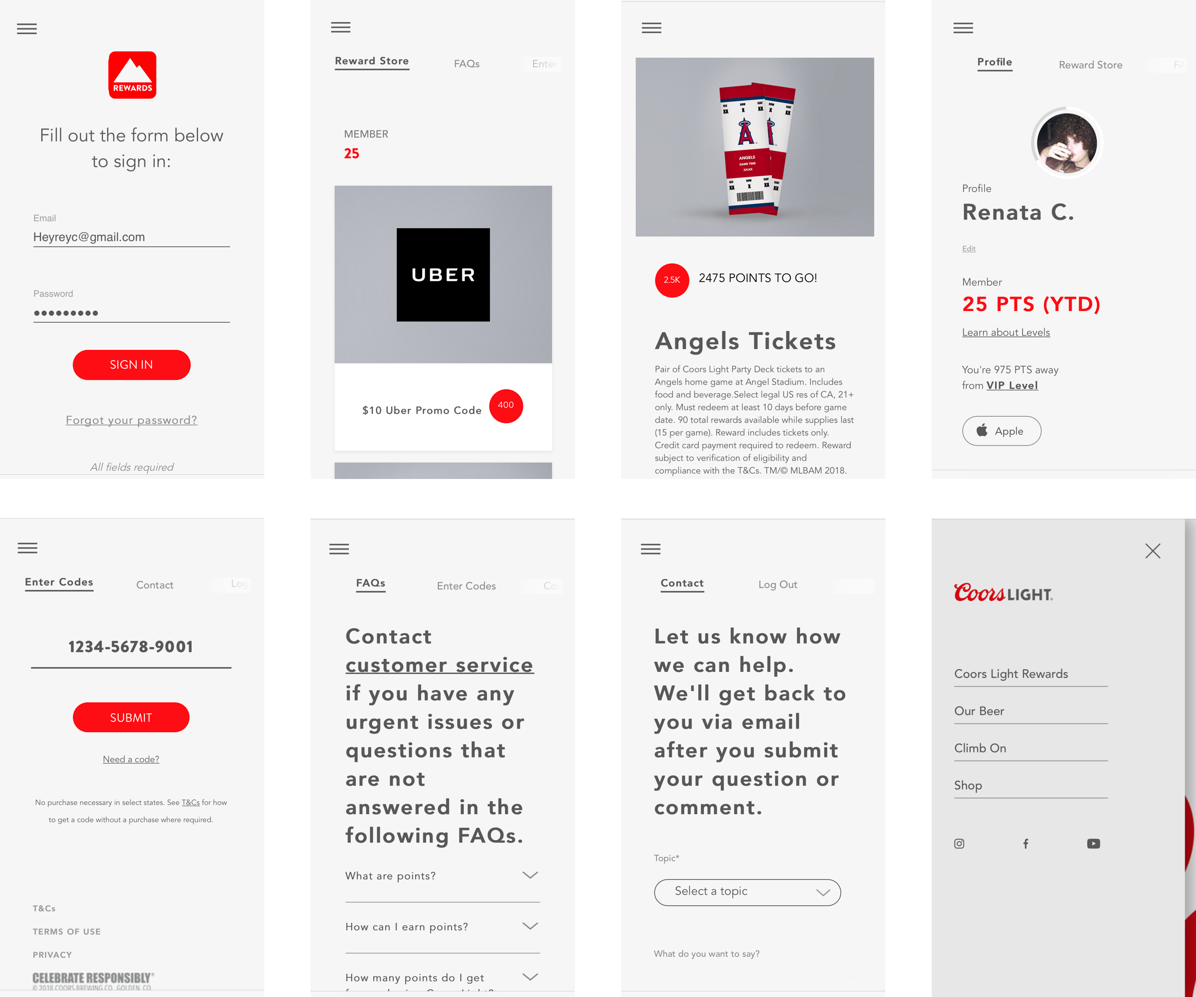
Coors Light Rewards Site Design
Coors Light Rewards is a tool for fans to enter the points codes attached to each Coors Light 12 pack
or by winning points by playing trivia at local bars. Simply check-in using the app and play a few rounds
to gain points and prizes.
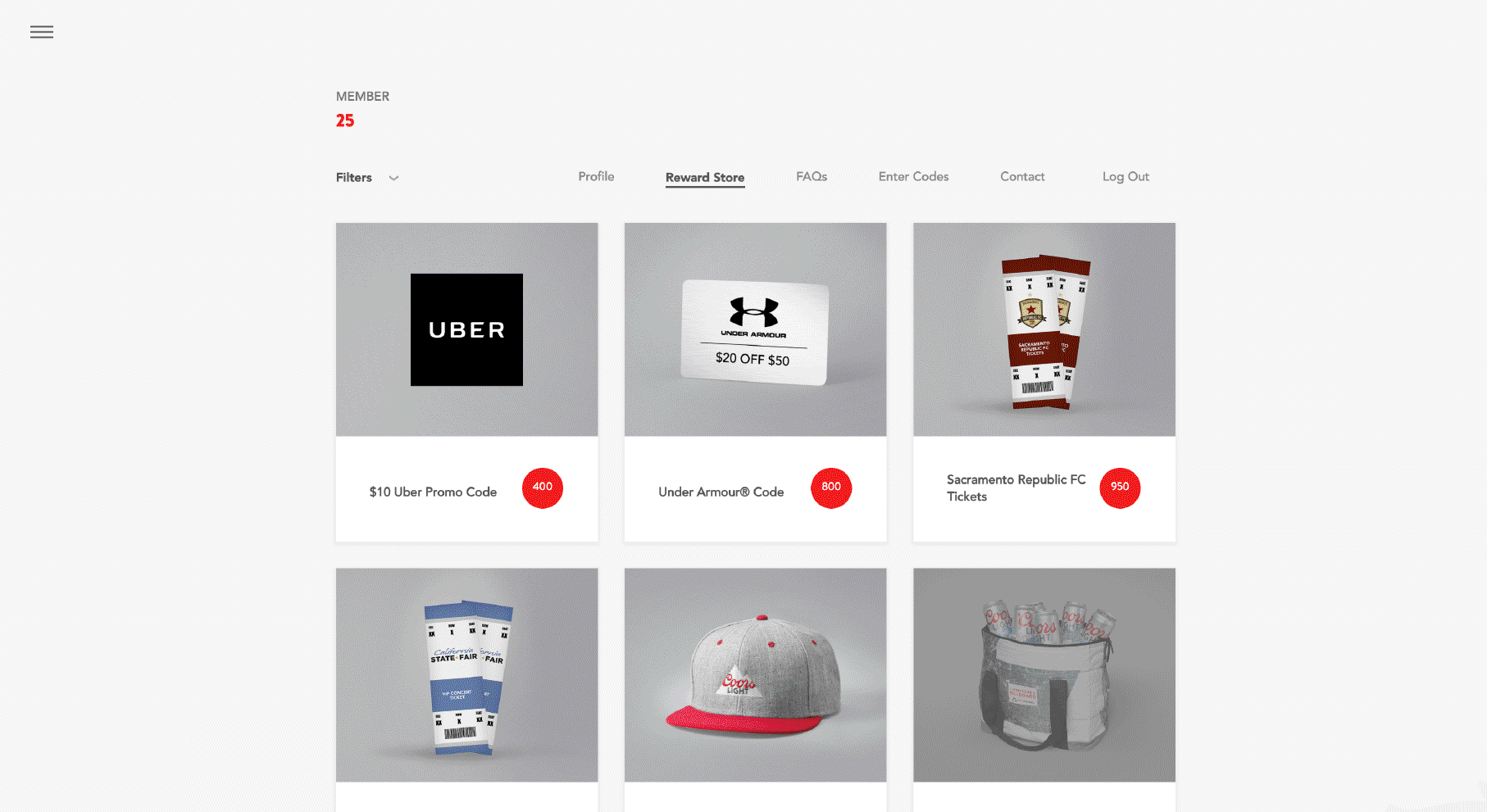
Those points can be redeemed for gear and experiences, like Uber cash, baseball tickets,
or an amazing mountain-shaped cooler.
My job was to improve the design, upgrade the UX, gamify the app, and create an abbreviated
desktop experience.
We then user tested multiple options before landing
on the most optimal fan experience.
In-Site Trivia Game